That was a term I first heard used by Wolf Kahn, a New York City/Vermont artist (and colorist) who can paint a barn turquoise green, a sky pink, and tree trunks lavender. (When giving a talk at our local museum, he came in emerald green trousers and a yellow T-shirt.) Describing seasonal landscapes, he once said that it was in autumn that "nature gives you permission to use outrageous colors" ... though he added that one can use this same bright palette anytime. "Intense colors are always available," he said, whether that meant choosing magenta, say, to paint shadows or turning a river yellow. He liked using bright colors because they stretched one's vision and also kept him and his viewers from being bored. Pretty, he didn't want; unusual, he did. But he also felt that because his colors were so intense, he needed to keep his subject as simple as possible. So: a river, some trees, a sky. Or: a barn, a sky. Or: a line of trees, a mountain, some sky.
But getting back to enjoying this season's color palette, here are my watercolor renderings of autumn in our part of the world.
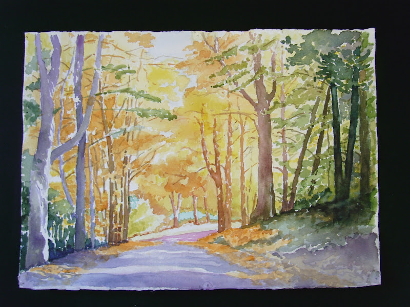
The challenge with this first painting was to paint the negative space around the trees rather than the trees themselves. That took a lot of concentration since I didn't draw the trees in very carefully, not wanting to get too fiddly about it and also knowing that even if I did delineate everything before painting it, I'd probably get confused along the way. In the long run, I did manage to leave the branches and trunks bare, letting the white paper show through. Later, I added shadow-like purple washes here and there.
 | ||
| West Dummerston Mail Boxes |
 | ||
| West Hill Road |

I decided to paint this when I saw how beautifully the trees behind me were reflected in the glass doors and windows of my friend's house.
 |
| Mt. Wantastiquet in Autumn |
 |
| Dutton Farm Road in November |
 | ||
| Kipling Road Country Walk |
Next week's posting will show photos of autumn in Vermont.
Your technique of different colors on each side is neat! It does seem to give the painting life & interest, yet looks completely natural (I'd never noticed before!). Lovely paintings, and lovely designs--I can picture some being block prints or hooked rugs because of their dynamic composition. Thank you for sharing!
ReplyDelete